Typography

Typography by the Homeless

Sadly, the sight of a homeless person holding a hand-scrawled sign asking for spare change has become all too familiar in cities around the world. Barcelona-based Arrels Foundation and The Cyranos McCann ad agency found a novel way to respond to such handwritten appeals. They created Homelessfonts.org to market typefaces drawn by the homeless in Barcelona to businesses for use in advertising and packaging. In different workshops, volunteer design professionals led homeless participants through various typographic exercises, which were then scanned and converted into usable fonts. The fonts are being sold on the Homelessfonts.org website, and collected funds are being used by Arrels to offer shelter, food, and social and health care services to the indigent in Barcelona. Arrels reports that about 3,000 homeless are currently in Barcelona, 900 of whom actually live in the street. Type design is an unusual charitable fund-raising initiative, to say the least, but it has given Arrels the resources to care for nearly half of the homeless in Barcelona.

Typography

2015 Typography Calendar

2015_Type_Cal

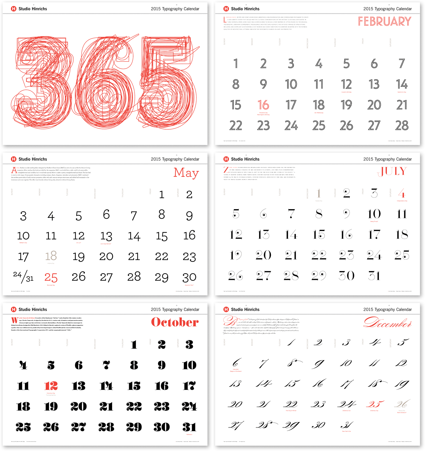
For the past 13 years, Kit Hinrichs has been indulging his fascination with typography by creating the “365” calendar, featuring 12 different typefaces, one for each month of the year. What makes him happy (in my opinion) is viewing each letterform as its own little sculpture — whereas combining characters into words and sentences distract from seeing typography as its own art form. For the 2015 calendar, Kit asked his design staff to nominate fonts that intrigue them and assembled a mix of traditional, avant garde, serif, sans serif, display, and script faces. Then for the 13th straight year, he cajoled me into writing the text. The 365 Typography Calendar for 2015 is now available for sale via Amazon, major U.S. art museums, and from Studio Hinrichs. The calendar comes in two sizes: 23” x 33” (58.5cmx84cm) for $44 retail and 12”x18” (30.5cm x 45.75cm) for $26 retail. Design professionals, particularly, love this calendar and display it prominently to prove their “street creds.” Order now.

Packaging

The Best Type of Wine

Trapl_Wine_1
Like fine wine, beautiful typography adds a touch of elegance wherever it appears. Creative agency Typejockeys in Vienna, let the typography serve as the graphic identity and packaging for Trapl, an award-winning wine made in Stixneusiedl, Austria, by vintner Johannes Trapl. Each of the seven varieties in the Trapl line has a uniquely designed label featuring Typejockeys’s hand-drawn letters, frames and ornaments. All the legal information is integrated into the wraparound typographic label, so there is no “back side.” Copper-colored foil stamping and blind embossing make for a sophisticated design that is consistently carried through even on the packing boxes.
Read More »

Branding

52 North: The Address, The Name,
The Brand Identity

N52_interior4-01

What’s black-and-white and impossible to ignore? The graphic identity of 52 North, a hip restaurant and bar in London. UK-based design studio I Love Dust and interior architects 44th Hill used scale and contrast to make us aware of the geometric beauty of typography. The huge letterforms become another shape in a collage of stripes, dots, stars and diamond angles. In 52 North’s restaurant and bar, warm wood furnishings soften the starkness of the letterpress-style mural, but the mural itself becomes like a “menu” of decorative shapes that can be mixed and matched on packaging and printed materials, making each piece look slightly different yet part of the overall brand. It’s a complete identity program with room to grow.

Read More »

Design Quizzes

Script Logotypes

Script_Quiz_NEW
Hand-drawn script logotypes convey a lot about the personality of a brand. The letter may look breezily dashed off, elegant, relaxed, energetic, confident, approachable, quirky or playful. The thicks and thins of the letterform, the extra embellishment, or lack thereof, hint at how the company wants to be perceived. Script letters feel more like personal signatures – individual and unique. This quiz is to see if you can name the brand that owns these logotypes. See answers after the jump.
Read More »