via OpenLearn from The Open University’s YouTube Page
For those who were oblivious to the fact that July 17 was World Emoji Day, it is not too late to pause and reflect on how emojis have enriched communications in cultures around the globe. Emoji will be honored in history with the same respect as cave paintings, Gutenberg’s first movable type and motion pictures. It is a graphic language that allows emailers to give nuance to the meaning of their messages. Those in the graphic arts should be proud. 😉
Writing a resume for a job in a design studio is different than applying for a corporate manager position. Aside from wanting to know the usual list of previous employment and education, design employers look for clues that the applicant has the skills that designers need and will fit compatibly on the design team. It’s not just what you say, but how you present it.
Here are 10 tips on preparing a resume that works:
1. Do your homework first.
Check out the design studio’s website and do a google search to look at the firm’s design style, past projects, industry recognition, staffing, philosophy, etc. This will reveal a lot about whether you are a good fit for the studio, and vice versa.
2. Include a Cover Letter
Include a brief cover letter with your resume, even if you are sending an unsolicited application or responding to an online job posting. A personalized letter is not only polite, it indicates that you specifically want to work there, and are not blanketing the entire design world with your resume. If you have been referred by someone known to the firm, include that too.
3. Tell Them Where You Worked
Provide a career chronology and dates of employment. Also cite your primary duties and name some of the key accounts you worked on. If you were freelancing, name some of your clients and the scope of your assignments.
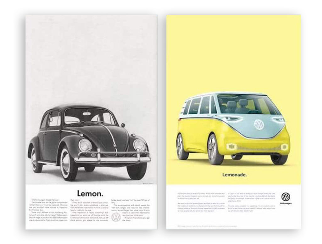
For baby boomers who came of age in the late 1960s, the VW Beetle is a symbol of carefree youthful abandon, beach parties, rock concerts, and living happily on a shoestring. It was a protest against the materialism of the older folks and their thirst for big cars with long tail fins. Aware that the humpbacked VW Bug could not compete on speed, comfort or sleek styling, ad agency Doyle Dane Bernbach had the chutzpah to turn the Beetle’s shortcoming into a symbol of hipness with bluntly honest slogans like “Think Small” and “Lemon.” It worked. By 1973, VW had sold more than 16 million Beetles worldwide.
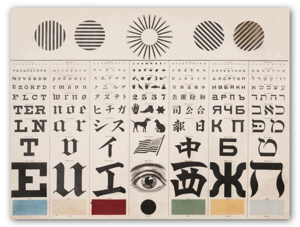
George Mayerle’s Eye Chart in Roman, Hebrew and Chinese
Designers are a trend-conscious lot when it comes to typography. They like to keep up with the latest edgy typefaces, and will opine endlessly over the historical contributions of Baskerville and Caslon, discuss the attitude evoked by various faces, and when too much kerning or letter spacing makes words illegible… yada, yada, yada, yawn.
Forget all that. Your design-centric pontificating doesn’t matter when it comes to the best typeface for eye exam charts.
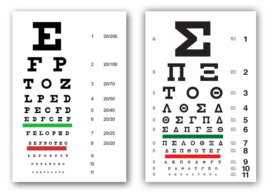
English Eye Chart, Left and Greek Eye Chart, Right
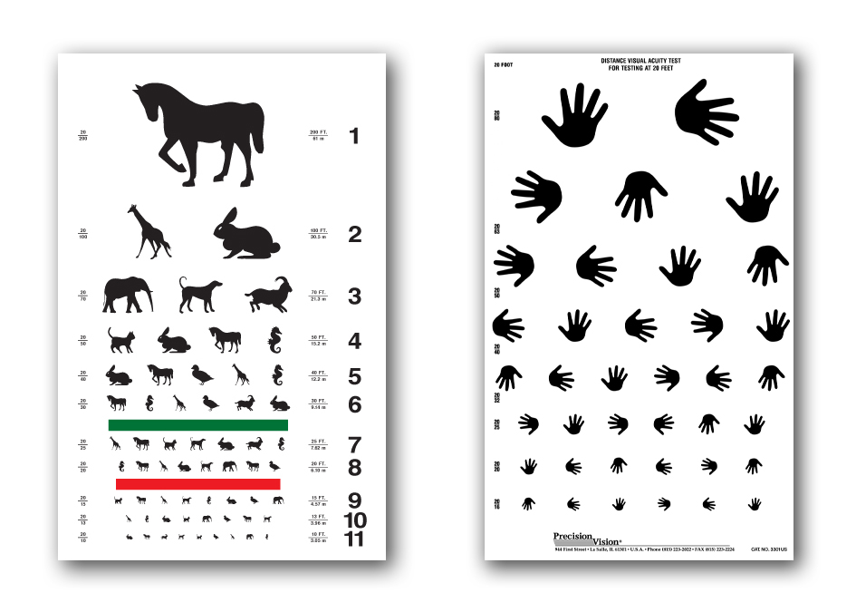
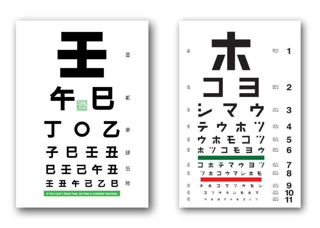
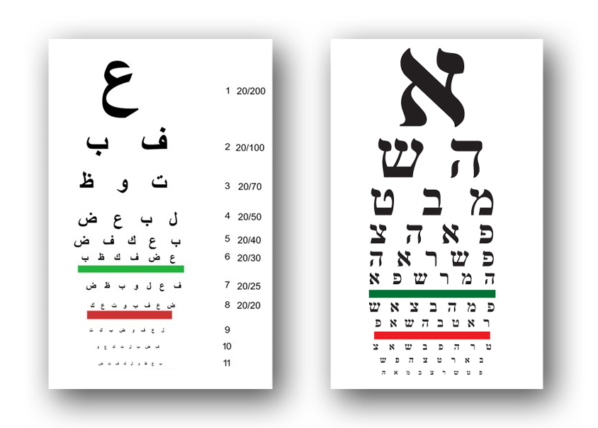
Eye exam charts are not designed to be elegant or trendy. They are based on medical science and geometric measurements. We can’t speak for how “optotype” is rendered in Chinese or Hebrew, but the letters on the English charts are all caps with no thicks or thins in the letterforms. The same principles undoubtedly apply in other language eye charts as well. In the case of children and people who can’t read, eye charts test the ability to recognize familiar animals and the direction a hand is pointing.
Dutch eye doctor Hermann Snellen developed the now famous Snellen eye chart in 1862 by asking patients to cover one eye and read letterforms on a 5×5 grid, while standing 20 feet (or 6 meters away). The optotype is based on simple geometry in which the thickness of the lines equals the thickness of the white spaces between lines and the thickness of the gap in the letter “C”. The height and width of the type must be five times the thickness of the line.
Animal and Hand Direction Eye Charts for Children
Chinese Eye Chart, Left and Japanese Eye Chart, Right
Arabic Eye Chart, Left and Hebrew Eye Chart, Right
The common Snellen chart uses only ten letters C, D, E, F, L, N, O, P, T, Z. The British Standards Institution specifies twelve letters — C, D, E, F, H, K, N, P, R, U, V, Z — based on the equal legibility of the letters. It also requires uniform luminance. Visual acuity tests in doctor’s offices use the same eye charts, but exams for a motor vehicle license randomize letters so vision impaired motorists can’t cheat by memorizing the sequence of letters on the chart.
What’s a good analogy to describe how people talk to their Google Home Hub? The way kids talk to their mothers and always expect her to be there and respond. No “please” or “thank you’ or “when you finish what you’re doing,” but simply “hey, Mom.” Released in time for Mother’s Day, this commercial by Wieden & Kennedy for Google’s Home Hub draws a parallel with how people talk to their Home Hub and other Google support devices. No prefaced niceties, but just “hey Google, call my office,” “hey Google, where’s the nearest Starbucks,” “hey Google, tell me how to get to the bridge from here.” That’s okay, don’t feel sheepish. Google, afterall, is internet technology designed to do your bidding. Moms, on the other hand, occasionally like hearing how much she is appreciated.