Humorous Advertising

Believe It or Not – April Fools’ Day Ads

Is it brand advertising?  Yes.  Is the product offering real?  No way.

April Fools’ Day is an excuse for ad people worldwide to take a break from practicing “truth in marketing” and spin fanciful selling points that stretch credulity to the breaking point, and make even gullible people go “Huh??”

April Fools’ Day spoofs are an advertising tradition and lately they have become more elaborate and expensively produced to capture the interest of social media and go viral. Some ad pitches told with a straight face (wink wink) include Rent-a-Runway wardrobes for dogs, Virgin Australia offering inflight spin classes, Seiko making watches for ninjas, Heinz selling chocolate mayonnaise in the U.K.   Funny and in good fun, April Fools’ Day advertising is becoming something that consumers look forward to seeing like Super Bowl commercials. It’s feel-good advertising that make consumers like a brand that enjoys having fun.  Here are a few April Fools Day ads from 2018.

Read More »

Design the Product into the Packaging


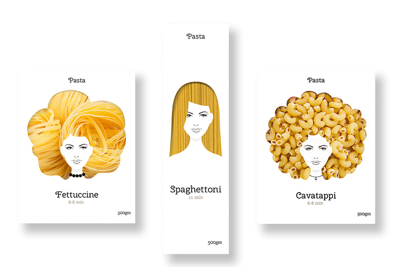
Why try to describe the product with images and words, when you can die-cut the package and give shoppers a peek inside? Especially when it comes to pasta noodles, it is helpful to see what the actual noodles look like instead of trying to recall the difference between fettuccine, rigatoni, vermicelli, macaroni, etc. This concept packaging by Moscow-based designer Nikita Konkin used the different shapes and textures of pasta noodles to create silhouettes of fanciful hairstyles in the die-cut windows. The noodle hairstyles framed a simple one-color line drawing of a woman’s face in a memorable and playful way.
Read More »

Publishing

Anatomy of a Perfect Serial Crime (Novel)

Book_Jacket_Anatomy

When it comes to looking for the latest crime novel by your favorite best-selling author, fans don’t want the mystery to begin in the bookstore, so publishers sprinkle graphic clues on the jacket cover to lead shoppers to the writers they want. The covers, shown here, are by designer Peter Mendelsund, associate art director at Knopf, for the Jo Nesbo series; design firm Richard, Brock, Miller and Mitchell (RBMM) for the Dick Francis horse-racing murder mysteries, and designer Michael Stirrings for the Sue Grafton alphabet murders. In such cases, the cover design “brands” the book as part of a series, and signals the likely appearance of recurring main characters — e.g., Nesbo’s detective Harry Hole and Grafton’s Kinsey Milhone. Familiarity sells.

Read More »